Archive for September, 2009

Picture this! The news graphed.

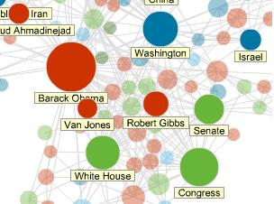
slate news dotsSlate added a curious addition to its site last week. Its heart is in the right place, and this is a good experiment, not a silly one.

I believe there’s extraordinary value to be unlocked by mapping a world of articles onto the social graph that they describe textually. I’ve written about graphing the news when I awkwardly described a scheme here and geeked out over a pretty picture here. Yes, there is a funny thing about social networks: they often describe the real world as well as sometimes exist as their own worlds. Done right, Slate’s graph could be an eye-opening mechanism for aggregating, sorting, discovering, following, sharing, and discussing the news.

But I don’t think Slate has quite done it right. In short, there’s too much information in the nodes, or the “dots,” as Slate calls them, and there’s too little information in the edges, or the links that connect up those dots. So permit me a little rambling.

We don’t really care all that much about the differences between a person, a group, and company—not at this top level of navigation, anyhow. There are too many dots, and it’s too hard to keep them all the colors straight. Of course, it’s not that hard, but if Slate’s project is fueled by bold ambition rather than fleeting plaudits, it’s just not easy enough. They’re actors. They’re newsmakers. They are entities that can be said to have a unified will or agency. And that’s enough. Make up a fancy blanket term, or just call them “people” and let smart, interested users figure out the details as they dive in.

Moreover, assistant editor Chris Wilson confuses his own term “topic.” At first, he writes, “News Dots visualizes the most recent topics in the news as a giant social network.” Also, “Like a human social network, the news tends to cluster around popular topics.” In this sense, a “topic” is an emergent property of Slate’s visualization. It’s the thing that becomes apparent to the pattern-seeking, sense-making eyes of users. So “one clump of dots might relate to a flavor-of-the-week tabloid story” or “might center on Afghanistan, Iraq, and the military.”

But then Wilson makes a subtle but ultimately very confusing shift. Explaining how to use the visualization, he writes, “click on a circle to see which stories mention that topic and which other topics it connects to in the network.” Problem is, these “topics” are what he has just called “subjects.” As emergent things, or “clumps,” his original “topics” can’t be clicked on. On the contrary, “subjects—represented by the circles below—are connected to one another,” and they’re what’s clickable.

To make matters worse, Wilson then, below the visualization, introduces more confusing terms, as he describes the role played by Open Calais (which is awesome). It “automatically ‘tags’ content with all the important keywords: people, places, companies, topics, and so forth.” The folks at Thomson Reuters didn’t invent the term “tag,” of course; it’s a long-standing if slippery term that I’m not even going to try to explain (because it really, really is just one of cases in which “the meaning of the word presupposes our ability to use it”). At any rate, Wilson seems like he’s using it because Open Calais uses it. That’s fine, but a bit more clarity would be nice, given the soup of terms already around. And there’s really little excuse for dropping in the term “keywords” because, with his technical hat on, it’s just wrong.

I’m terribly sorry to drag you, dear reader, through that intensely boring mud puddle of terminology. But it’s for good reason, I think. Graphing the news is supposed to be intuitive. The human mind just gets it. A picture is worth a thousand words. Taken seriously, that notion is powerful. At a very optimistic level, it encourages us to let visualizations speak for themselves, stripped of language all too ready to mediate them. But at a basic level, it warns us writers not to trample all over information expressed graphically with thousand textual words that add up to very little—or, worse, confusion.

But, yes, okay, about those prenominate the edges, or the links that connect up those dots! I wrote about this long ago, and my intuition tells me that it doesn’t make sense to leave edges without their own substance. They need to express more than similarity; they can do more than connect like things. If they were to express ideas or events or locations while the nodes expressed topics, it seems to me that the picture would be much more powerful. Those ideas, events, or locations wouldn’t sit in light blue “Other” nodes, as Slate has them; instead they would directly link up the people and organizations. The social network would be more richly expressed. And topics, in Wilson’s original sense, wouldn’t be emergent “clumps” but actually obvious connections.

All in all, the visualization is “depressingly static,” as a friend of mine remarked. There may be two levels of zoom, but there’s no diving. There’s no surfing, no seeing a list of stories that relate to both topic x AND topic y. There’s no navigation, no browsing. There’s no search—and especially none involving interaction between the human and computer. There’s no news judgment beyond what newspaper editors originally add. And the corpus is small—tiny, really, representing only 500 articles each day, which isn’t so far from being a human-scale challenge. Visualizations hold the most promise for helping us grapple with truly internet-scale data sets—not 500 news articles a day but 500,000 news articles and blog posts.

It seems unfair to hold Slate to such a high standard, though. It’s very clear that they were shooting for something much more modest. All the same, maybe modesty isn’t what’s called for.

Curating the News Two Ways

There are two relatively new efforts to curate the best links from twitter. They’re both very simple tools, and their simplicity is powerful.

As with any good filter of information, there’s a simple, socially networked mechanism at play, and analyzing how that mechanism works helps us predict whether a tool will thrive. The name of the game is whether a mechanism fits social dynamics and harnesses self-interest but also protects against too much of it. (This kind of analysis has a storied history, btw.)

First came 40 twits, Dave Winer’s creation, with instances for himself, Jay Rosen, Nieman Lab, and others. It’s powered by clicks—but not just any clicks on any links. First Dave or Jay picks which links to tweet, and then you and I and everyone picks which links to click. There are two important layers there.

Like the others, Dave’s instance of 40 twits ranks his forty most recent tweets by the number of clicks on the links those tweets contain. (Along the way, retweets that keep the original short URL presumably count.) The result is a simple list of tweets with links. But If you’re reading Dave’s links, you know Dave likes the links by the simple fact that he tweeted them. So the real value added comes from how much you trust the folks who are following Dave to choose what’s interesting.

Note well, though, that those self-selected folks click before they read the thing to which the link points. They make some judgment based on the tweet’s snippet of text accompanying the links, but they may have been terribly, horribly disappointed by the results. Of course, this presumably doesn’t happen too too much since folks would just unfollow Dave in the longer term. In equilibrium, then, a click on a link roughly expresses both an interest generated by the snippet of text and a judgment about the long-term average quality of the pages to which Dave’s or Jay’s links point. Dave adds the data (the links), and his followers add the metadata (clicks reveal popularity and trust).

Are there features Dave could add? Or that anyone could add, once Dave releases the source? Sure there are. For one, it doesn’t have to be the case that all clicks are created equal. I’d like to know which of those clicks are from people I follow, for instance. I might also like to know which of those clicks are from people Dave follows or from people Jay follows. Their votes could count twice as much, for instance. This isn’t a democracy, after all; it’s a webapp.

But think a bit more abstractly. What we’re really saying is that someone’s position in the social graph—maybe relative to mine or yours or Dave’s—could weight their click. Maybe that weighting comes from tunkrank. Or maybe that weighting comes from something like it. For instance, if tunkrank indicates the chance that a random person will see a tweet, then I might be interested in the chance that some particular person will see a tweet. Maybe everyone could have a score based on the chance that their tweet will find its way to Dave or to me.

Second came the Hourly Press, with an instance Lyn Headley calls “News about News.” It’s powered not by clicks—but by tweets. And, again, not just any tweets. Headley picked a set of six twitter users, called “editors,” including C.W. Anderson, Jay Rosen, and others. And those six follow very many “sources,” including one another. There are two important layers there, though they overlap in that “editors” are also “sources.”

“News about News,” a filter after my own heart, looks back twelve hours and ranks links both by how many times they appear in the tweets posted by a source and also by the “authority” of each source. Sources gain authority by having more editors follow them. “If three editors follow a source,” the site reads, “that source has an authority of 3” rather than just 1. So, in total, a link “receives a score equal to the number of sources it was cited by multiplied by their average authority.” Note that what this does, in effect, is rank links by how many times they appear before the eyes of an editor, assuming all editors are always on twitter.

The result is a page of headlines and snippets, each flanked by a score and other statistics, like how many total sources tweeted the link and who was first to do so. If you’re already following the editors, as I am, you know the links they like by the simple fact that they tweeted them. But no editor need have tweeted any of the links for the to show up on the Hourly Press. Their role is to just to look at the links—to spend their scarce time and energy following the best sources and unfollowing the rest. There are incredible stores of value locked up in twitter’s asymmetrical social graph, and the Hourly Press very elegantly taps them.

Note well, though, that editors choose to follow sources before those sources post the tweets on the Hourly Press. Editors may be terribly, horribly disappointed by the link that any given tweet contains. But again, this presumably doesn’t happen too too much since those editors would unfollow the offending sources. In equilibrium, then, a tweet by a source roughly expresses the source’s own interest and the editor’s judgment about the long-term average quality of the pages to which the source’s links point. Sources add the data (the links), and editors add the metadata (attention reveals popularity and trust).

There’s so much room for the Hourly Press to grow. Users could choose arbitrary editors and create pages of all kinds. There’s a tech page just waiting to happen, for instance. Robert Scoble, Marshall Kirkpatrick, and others would flip their lids to see themselves as editors—headliners passively curating wave after hourly wave of tweets.

But again, I think there’s a more abstract and useful way to think about this. Why only one level of sources? Why not count the sources of sources? Those further-out, or second-level, contributing sources might have considerably diminished “authority” relative to the first-level sources. But not everyone can be on twitter all the time. I’m not always around to retweet great links to my followers, the editors, and giving some small measure of authority to the folks I follow (reflecting the average chance of retweet, e.g.) makes some sense.

But also, editors themselves could be more or less relatively important, so we could weight them differently, proportionally to the curatorial powers we take them to have. And those editors follow different numbers of sources. It means one thing when one user of twitter follows only fifty others, and it means something else altogether when another user follows five hundred. The first user is, on average, investing greater attention into each user followed, while the second is investing less. Again, this is the attention economics that twitter captures so elegantly and richly.

But it’s important to circle back to an important observation. In both apps, there are two necessary groups. One is small, and one is large. One adds data, and the other adds metadata. The job of the builder of these apps is to arrive at a good filter of information—powered by a simple, socially networked mechanism. That power must come from some place, from some fact or other phenomenon. The trick, then, is choosing wisely. Social mechanisms that work locally often fail miserably globally, once there’s ample incentive to game the system, spam its users, or troll its community.

But not all filters need to work at massive scale either. Some are meant to personal. 40 twits strikes me as fitting this mold. I love checking out Dave’s and Jay’s pages, making sure I didn’t miss anything, but if I thought tens of thousands of others were also doing the same, I might feel tempted to click a few extra times on links I want to promote. I don’t think a 40 twits app will work for a page with serious traffic. And, ultimately, that’s because it gets its metadata from the wrong source: clicks that anyone can contribute. If the clicks were some limited to coming from only a trusted group, or if the clicks weren’t clicks at all but attention, then maybe 40 twits could scale sky-high.

Hourly Press—which I don’t think is terribly well suited to being called a “newspaper,” because the moniker obscures more than it adds—doesn’t face this limitation. The fact that Hourly Press is powered by attention, which is inherently scarce, unlike clicks, is terribly powerful, just as the fact that twitter is powered by attention is terribly powerful. Write large, both are incredibly wise, and they contain extraordinarily important lessons in mechanism design of social filters of information.


Josh Young's Facebook profile

What I'm saving.

RSS What I’m reading.

  • An error has occurred; the feed is probably down. Try again later.